
BOAT – Aloe Vera Brand Identity & Packaging Design ahemad_designs
The more logos I design, the more I realize one thing.
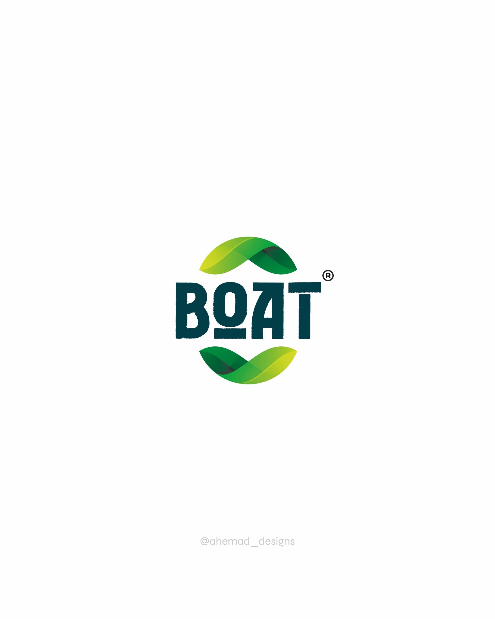
A logo should reflect the nature of the product.
For this aloe vera brand identity, I focused on creating a logo design that feels organic and natural. The flowing leaf elements represent growth and purity. The letter “O” is shaped to reflect the organic form of the leaf.
A simple idea, shaped to reflect the natural essence of the brand.
Open to new branding projects - feel free to connect or DM.
For branding and logo design projects :
📩 ahemad.design@gmail.com
📞 +91 73831 25219
Ahemad Designs
Brand Identity Designer | Health & Wellness Brand | India
05 Mar 2026
Keywords
Logo design
brand identity
branding design
packaging design
product packaging
wellness branding
healthcare brand
visual identity
graphic design
beauty branding
brand identity design
premium p