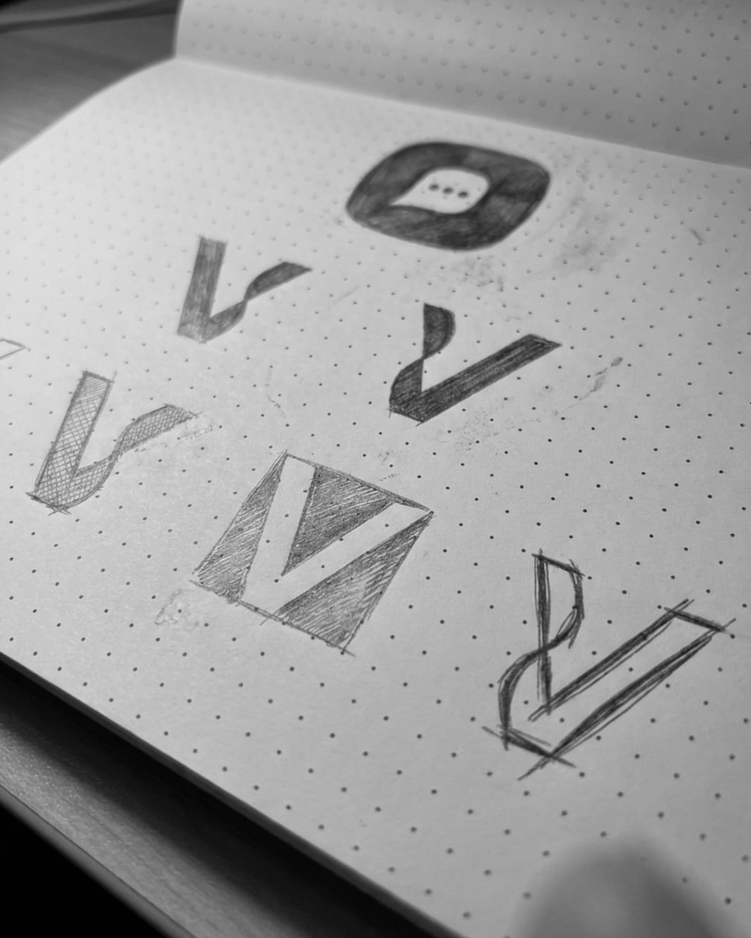
Hand-Drawn Logo Concepts in Progress
Be honest -
which sketch would you choose if this were your brand?
These are not final logos.
These are idea explorations.
On paper, I tested two core directions:
- A chat symbol, representing conversation, community, and digital interaction
- The letter V, taken from the brand name, explored through different structures and moods
Each sketch asks a different question.
Should the brand feel more conversational or more iconic?
Friendly or sharp?
Open or contained?
This stage matters.
Because strong logo design and brand identity are not about decoration -
they’re about choosing the right meaning before refining the form.
Nothing here is polished yet.
This is where clarity begins.
Now I’m curious -
which direction feels right to you?
For branding projects & partnerships:
📩 ahemad.design@gmail.com
📞 +91 73831 25219
-
Ahemad Designs
Brand Identity & Logo Designer | India
05 Feb 2026