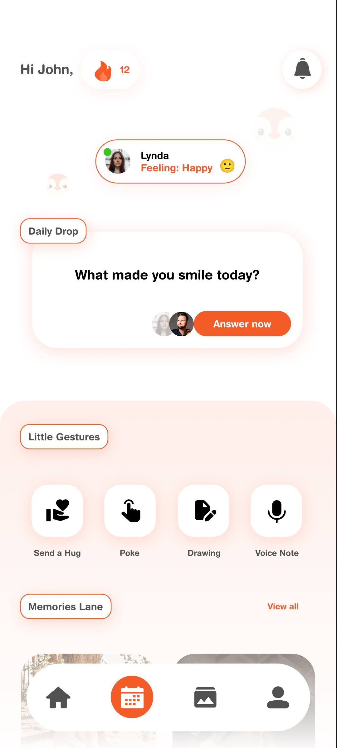
Hugsy Redesign
Designing for intimacy is different from designing for productivity. With Hugsy, my goal was to move away from the "feature-heavy" noise of traditional social apps and create a digital space that feels like a warm embrace.
I chose an emotion-first layout because the goal of Hugsy isn't to get tasks done. It’s to feel connected.
I focused on three pillars:
1. Immediate Connection: The "Partner Status" is at the top. It’s not about "last seen" or "typing..."; it’s about their current emotion. This builds empathy before a single word is even exchanged.
2. Shared Rituals: The "Daily Drop" question is the primary Call to Action. It’s time-relevant and action-oriented to give couples a low-friction way to engage every day.
3. Positive Reinforcement: Instead of a "don't break the streak" pressure tactic, I used a "12 days together" counter to celebrate the relationship's growth rather than penalize a missed day.
30 Dec 2025