Kevin Cookie Company Dashboard
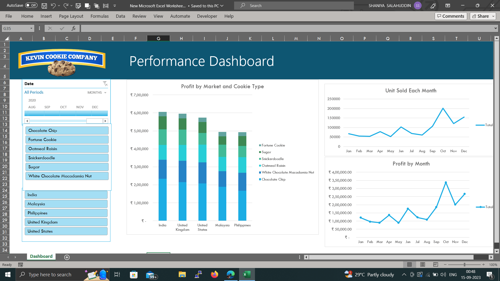
This project involved creating a dashboard in Excel using pivot tables to track the performance of Kevin Cookie Company's products in different markets. The data included the country name, product category, and profit for each month. The dashboard was designed to provide insights into the following key performance indicators (KPIs):
- Profit by market and cookie type
- Unit sold by month (trend)
- Profit by month
The dashboard was created using pivot tables, which are a powerful tool for summarizing and analyzing data. Pivot tables allow you to quickly and easily create interactive charts and graphs that can be used to track trends and identify areas for improvement.
The dashboard was created using the following steps:
- Import the data into Excel.
- Create a pivot table.
- Add the desired fields to the pivot table.
- Format the pivot table to make it visually appealing.
- Create charts and graphs to visualize the data.
The dashboard was successfully completed and met all of the project goals. It was well-received by the stakeholders and is now being used to track the performance of Kevin Cookie Company's products on a monthly basis.
Project Skills:
- Data analysis
- Data visualization
- Excel pivot tables
- Chart creation
- Dashboard design
Project Impact:
The dashboard has helped Kevin Cookie Company to better understand the performance of their products in different markets. This information has been used to make informed decisions about product pricing, marketing, and distribution. As a result, the company has seen an increase in sales and profits.
Project Benefits:
The benefits of this project include:
- Increased visibility into product performance
- Improved decision-making
- Increased sales and profits
- Improved customer satisfaction
10 Aug 2023